Chroma Climate
March 2024For my senior thesis, our cohort organized and curated a group gallery exhibition titled Warehouse 24. As part of the brand design team, I contributed to developing the exhibition’s identity, including the name, logo, and promotional posters.
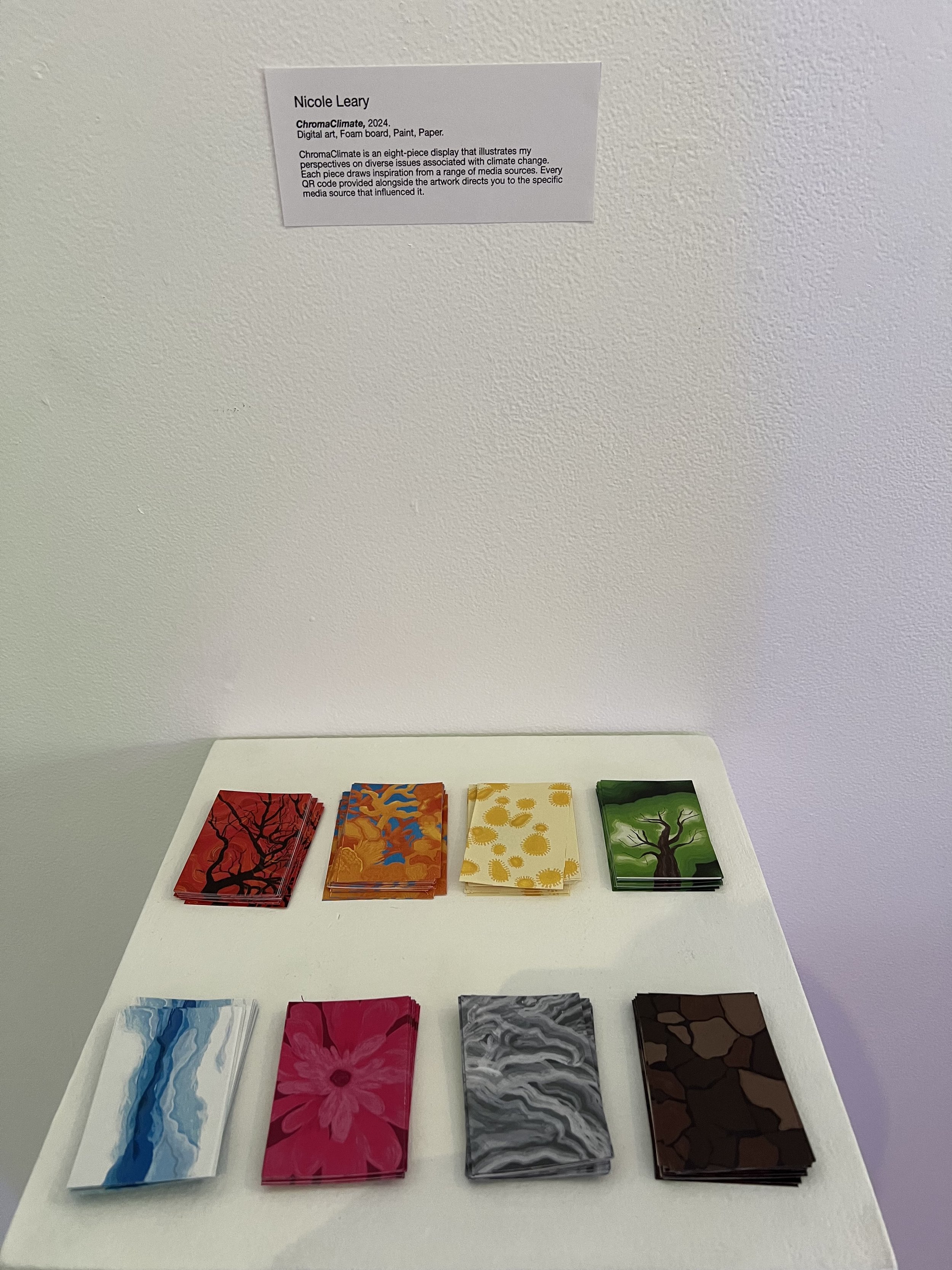
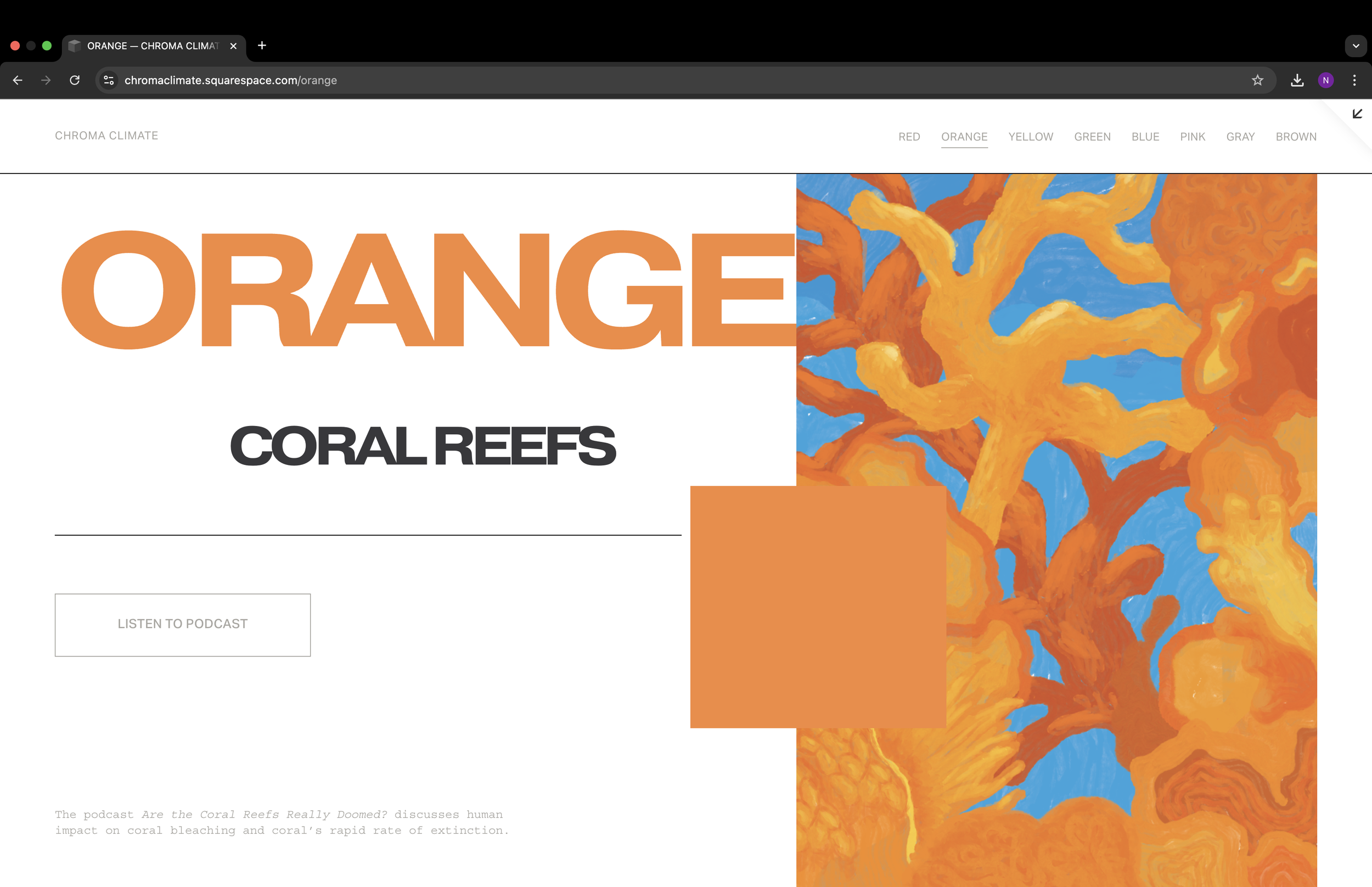
For my project, I chose to focus on climate change, aiming to raise awareness about the many interconnected aspects of the crisis and inspire viewers to take action. I structured the project around a color-coded system, where each color represented a different global issue directly tied to the effects of climate change. Each color was paired with a specific issue and an accompanying piece of informational media (such as a podcast, article, documentary, or YouTube video) to encourage deeper engagement and education. Below, I’ve included direct links to each piece of media alongside the corresponding graphic from the project.
The color-issue pairings were as follows:
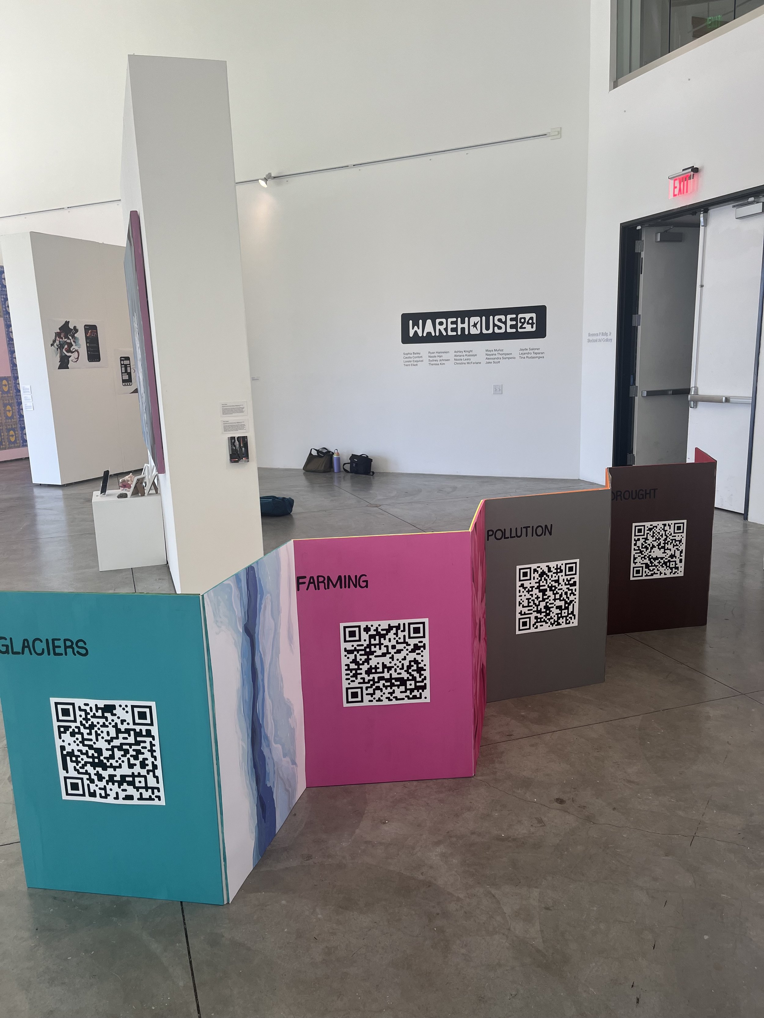
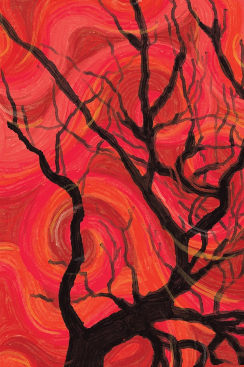
Red – Forest Fires, Orange – Coral Reef Bleaching, Yellow – Infectious Diseases, Green – Deforestation, Blue – Glacial Melting, Pink – Industrial Farming, Gray – Pollution, and Brown – Drought
Each visual graphic was designed at 2 ft x 3 ft and displayed in a zig-zag diagonal layout, creating an immersive walkthrough installation. This layout invited viewers to physically move through the project, engaging with each piece individually while experiencing the collection as a unified statement. Each graphic was displayed alongside a QR code that linked directly to a custom website I built, where the associated media sources were housed alongside the graphics.
To extend the project’s reach beyond the exhibition space, I designed takeaway cards—business card-sized pieces featuring the graphic on the front and the corresponding QR code on the back—so visitors could share the work and explore the content further on their own time.
Visually, I kept the typography minimal and clean, allowing the imagery and color to do the storytelling. The single-color design approach helped establish a strong visual identity for each issue, making the information more memorable and emotionally resonant. The goal was to create striking, attention-grabbing visuals that sparked curiosity and encouraged continued education and awareness.