Typography
2024-2025This is a selection of typography-focused projects I created over the past year, each exploring different styles, concepts, and applications of type in visual communication.
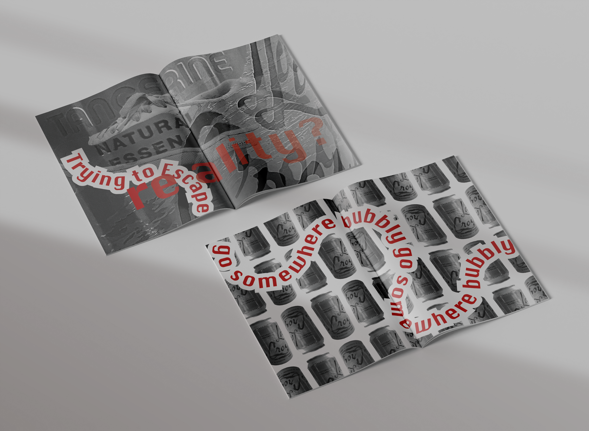
The first two pieces are magazine spreads designed for La Croix and Urban Outfitters. I challenged myself to use only black-and-white imagery, allowing a single, vibrant color in the typography to command attention and guide the viewer’s eye. I carefully experimented with text hierarchy, varying size, placement, and weight to establish visual rhythm and emphasize key messaging. The bold interplay between type and image adds a strong graphic edge to each composition.
The third project is a campaign designed to encourage carpooling on LMU’s campus, targeting a student audience. I developed a playful and engaging tone by crafting catchy slogans such as “Jump in the pool, share the fuel,” “Traffic’s down, laughter’s all around,” and “Save a dime, carpool all the time.” These phrases were brought to life through bold, high-impact typography paired with quirky, surreal carpool-inspired imagery. The rough-cut graphic style and assertive type choices were intended to convey the urgency of climate action while remaining approachable and fun. This campaign was designed with large-scale applications in mind—billboards, posters, and transit ads—to increase visibility and encourage real behavioral change.
The final project features three custom typefaces I designed, each inspired by the word Robust. The process began by hand-drawing 1 cm x 1 cm squares on paper and individually filling them in to form letterforms and abstract shapes. These analog beginnings gave the typefaces a raw, tactile quality that I carried through the digital phase, where I manipulated the squares to create variation and personality within each system. Each typeface was showcased in a poster featuring the full alphabet and the word Robust, designed to flow together as a continuous graphic. I used two bold, contrasting colors and minimal background elements to emphasize the structure and detail of the lettering, letting the type take center stage.